
Classic wedding photo booth templates are designs built for formal, traditional, or black-tie weddings: jewel tones, metallic accents, restrained florals, and serif typography. At Presto Entertainment we offer four go-to classic wedding templates across Vancouver, Victoria, and Nanaimo: Graceful Wedding (ivory and gold), Burgundy Party (deep burgundy and silver), Gold Party (opulent gold), and Brushed Chic (brushed rose gold). Pick based on your palette: jewel tones go with Burgundy, ivory palettes with Graceful, gold-forward weddings with Gold Party, and rose-gold palettes with Brushed Chic.
What defines a classic wedding photo booth template
A “classic wedding” template is not a single style. It is a set of visual choices that read as formal rather than trendy. Restrained color palettes. Metallic accents. Serif or script typefaces. Symmetrical layouts. Restrained floral elements.
If you are having a formal ceremony, printed paper invitations, a plated dinner, and a venue that feels established (like the Fairmont Pacific Rim in Vancouver, the Fairmont Empress in Victoria, or any cathedral reception), you are almost certainly in classic territory. A classic wedding template reinforces the formality. A modern or boho template creates visual dissonance with the rest of the day.
Classic is a crowded category and there are a lot of strong options. The four below are the ones we recommend most often at Presto, and they cover the four most common classic-wedding color lanes.
Our four go-to classic wedding templates
1. Graceful Wedding (Ivory and Gold)
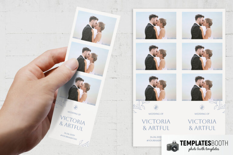
Ivory background, delicate gold foil filigree, restrained serif typography. This is the closest the TemplatesBooth library gets to traditional wedding stationery, which is why it ends up on so many Presto prints.
Best for: classic church weddings, classic white-and-gold palettes, couples whose invitations already use ivory and gold. Also works for 25th and 50th anniversary parties.
Skip it if: your palette is bold or bright. The ivory will read as off-white and forgettable instead of warm and intentional.
2. Burgundy Party (Jewel Tones)
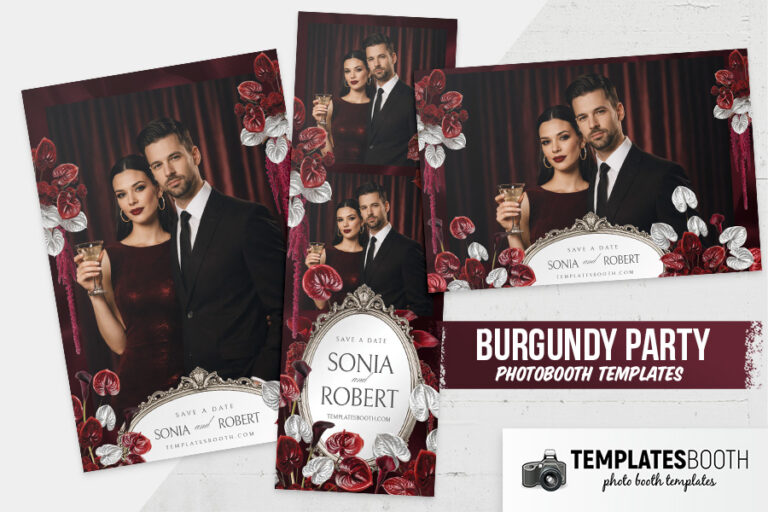
Deep burgundy red, silver accents, soft floral motifs. The strong pick for any couple whose wedding palette includes red, wine, maroon, or deep rose tones.
Best for: formal weddings with a jewel-tone palette, winter weddings, black-tie receptions, and upscale Vancouver receptions at places like the Fairmont Pacific Rim or the Rosewood Hotel Georgia. Pairs particularly well with dark wood venues and candle-forward decor.
Skip it if: your wedding palette is pastel or bright. The burgundy will fight your florals.
3. Gold Party (Opulent Gold)
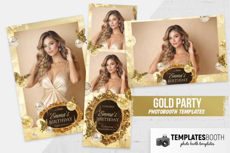
Radiant yellow-gold background, pearlescent accents, ornate gold frames. More opulent than Graceful Wedding. Gold Party reads as expensive first and wedding second.
Best for: upmarket weddings where the gold is the statement, NYE weddings, golden anniversary vow renewals, and any event at a venue with dark wood, rich textiles, or the kind of plaster-and-gold detailing you get at the historic hotels in Vancouver and Victoria.
Skip it if: your wedding is garden, rustic, or casual. The gold reads as formal and can overwhelm a softer setting.
4. Brushed Chic (Brushed Rose Gold)
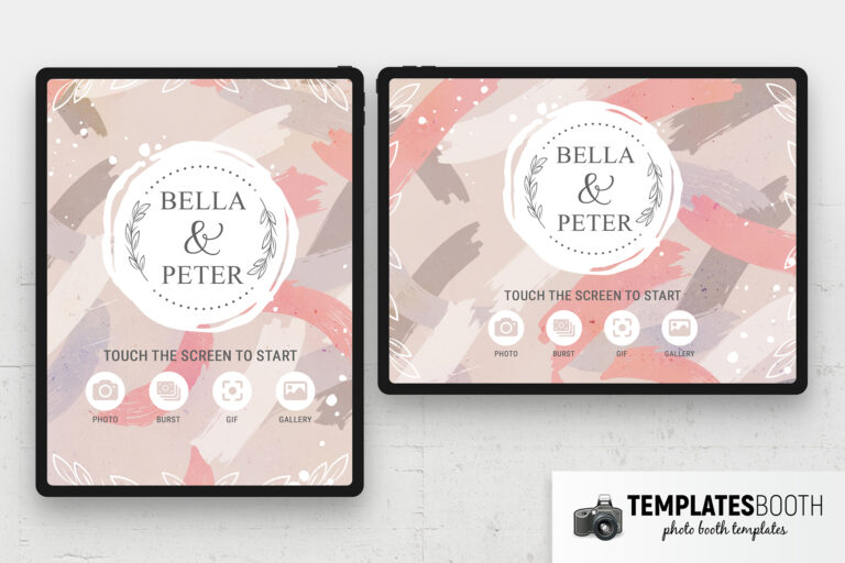
Soft brushed texture in rose-gold and ivory, script typography, subtle florals. Reads as elegant but unexpected, which is why couples who want classic-adjacent rather than fully traditional pick it.
Best for: rose-gold-forward weddings, blush and ivory palettes, couples who want elegant without strictly formal. A strong pick for Vancouver weddings going for the art-deco-meets-modern-romantic style that has been the local default for the past 5 years.
Skip it if: your wedding is full-formal (black-tie, grand ballroom). Brushed Chic will feel too delicate against the formality.
How to choose between them
The shortcut: pick by your palette first, not by the template’s mood. If your wedding is already burgundy and cream, the correct answer is Burgundy Party even if you feel more drawn to Graceful. When the photo strip hands a guest a cream print at a burgundy event, it looks wrong.
If your palette is genuinely ivory-and-gold (as about 30% of BC weddings are), the decision is between Graceful (restrained), Gold Party (opulent), and Brushed Chic (modern-romantic). Graceful is the default. Go to Gold Party if your venue is upmarket and the rest of the decor supports it. Go to Brushed Chic if your palette drifts toward rose-gold or you want the template to feel a bit more contemporary.
After almost 2,000 events since 2005, here is what we have learned: guests spend maybe five seconds looking at the design of their print. They spend the rest of the night holding it. Pick a template that ages well rather than one with a wow moment on first glance. Classic templates age better than trendy ones for exactly this reason.
How Presto helps you pick a template
When you book a photo booth with Presto Entertainment, template selection happens a few weeks before your event, not at the moment of booking. We send you a link to browse 16,000+ templates via our design partner TemplatesBooth, and you pick the one that matches your event. We then customize the chosen template with your names, wedding date, and any custom message, so the printout your guests walk away with is genuinely yours.
If you are stuck between two options, we will help you decide. Over 20 years at BC weddings has given us a pretty good read on which templates land.
Frequently asked questions
Can we customize a classic wedding template with our names and wedding date?
Yes. Every Presto photo booth template is customized with your names, wedding date, and any custom message before your event. We also adjust accent colors if your palette differs from the templates defaults.
How far in advance do we need to pick a template?
Two to three weeks before your wedding date is ideal. That gives time for customization and a proof round. Tighter turnarounds are possible. We have turned templates around in 48 hours when needed.
What if we do not see a classic wedding template we love?
The four above are our most-picked classic wedding templates, but TemplatesBooth has 16,000+ designs total and we can pull from any of them. We can also do a from-scratch custom design if nothing in the library fits. There is never a case where your print design is stuck.
What print formats do we get with a classic wedding template?
All Presto photo booth templates come with matching 2×6 photo strips and 4×6 postcard prints (both portrait and landscape). Welcome screens for the iPad or mirror booth are designed to match. You get all formats, not just one.
Does Presto offer classic wedding photo booths in Victoria and Nanaimo too?
Yes. We serve Vancouver, Victoria, Nanaimo, and everywhere in between. The same four classic templates are available regardless of event location.
See also
If classic is not quite right, browse our modern wedding templates (minimalist, geometric, clean-type) or garden wedding templates (botanical, rustic, outdoor). Our April 2026 new templates roundup also highlights recent arrivals.
Ready to book your wedding photo booth?
We cover Vancouver, Victoria, Nanaimo, and everywhere in between. Call 855-6PRESTO (855-677-3786) or request a quote and we will get you a real number within 30 minutes.